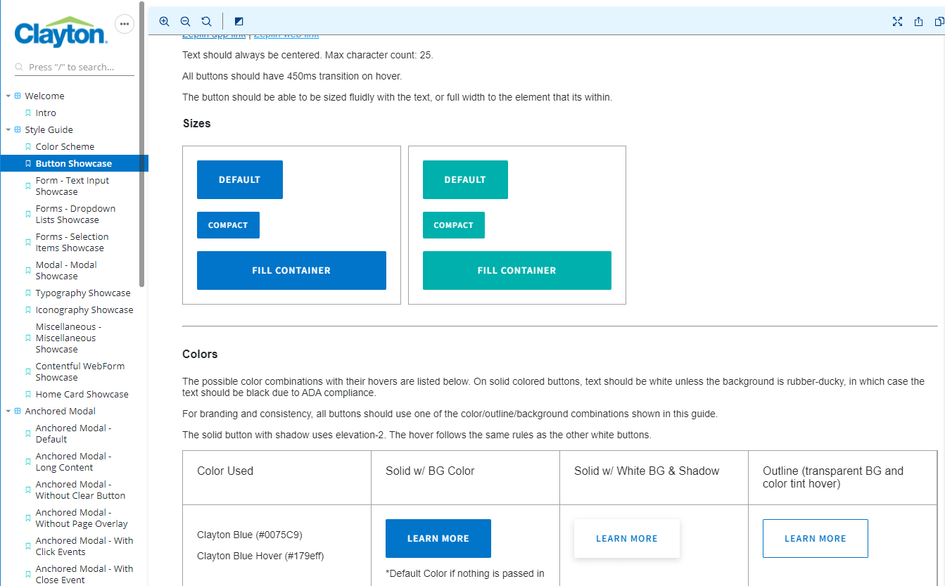
A couple years ago, at Clayton Homes, front end projects were inconsistent in terms of design, and had lots of duplicated code, which caused lots of duplicate work and wasted time. I noticed 5 different versions of what should be the same button on a single project - one might have a slightly different shade of blue, while one may have a slight gradient and a 3px border radius instead of 5px. These things may seem trivial to some developers, but as a dev who has a background in design, I quickly realized these inconsistencies added up quickly and were making our sites look like ransom notes.
The team needed a way to share the same library between multiple sites and to enforce consistency in design and front end code. I began working with the design team to set and enforce these standards.
I took the Sketch style guide and translated into code, showcased by Storybook. After creating a proof-of-concept, I was able to get non-technical stakeholder buy in for the shared component project. I worked with DevOps to create an NPM package so the library could be used in multiple projects.
Developers are discouraged to override styling of these components. If a developer needs something that is not in the style guide, I encourage them to work with design, and add to the component itself, as well as the visual test cases in Storybook.
This project has been a great success, for two different teams, as well as outside contractors. Everyone, including non-coding stakeholders, now see the value in this component library. Development time is faster. Using our “legos”, I developed a last-minute landing page in a matter of hours. I just had a developer tell me the other day that he was able to reduce a 13 point story to a 5 point story since he could use the component library.
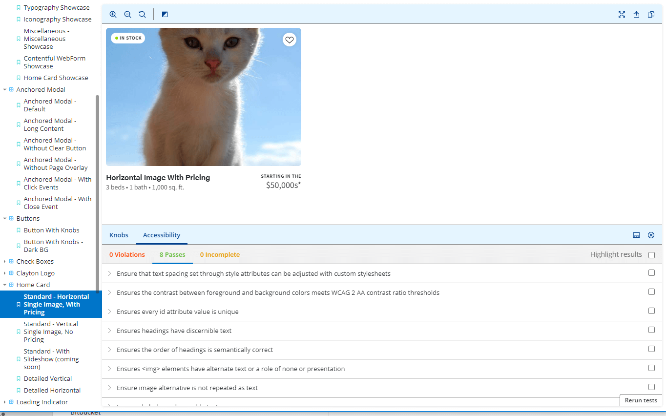
QA time is faster. Sites are more uniform. Accessibility concerns can be addressed among several projects at once, creating an inclusive experience for users with screen readers or slower devices. Google Lighthouse scores went from the 50s to 80s+, decreased bounce rate, better performance on mobile. I use storybook to test AA accessibility on the components. It's easy to make sites inclusive of users with screen readers and slower devices.
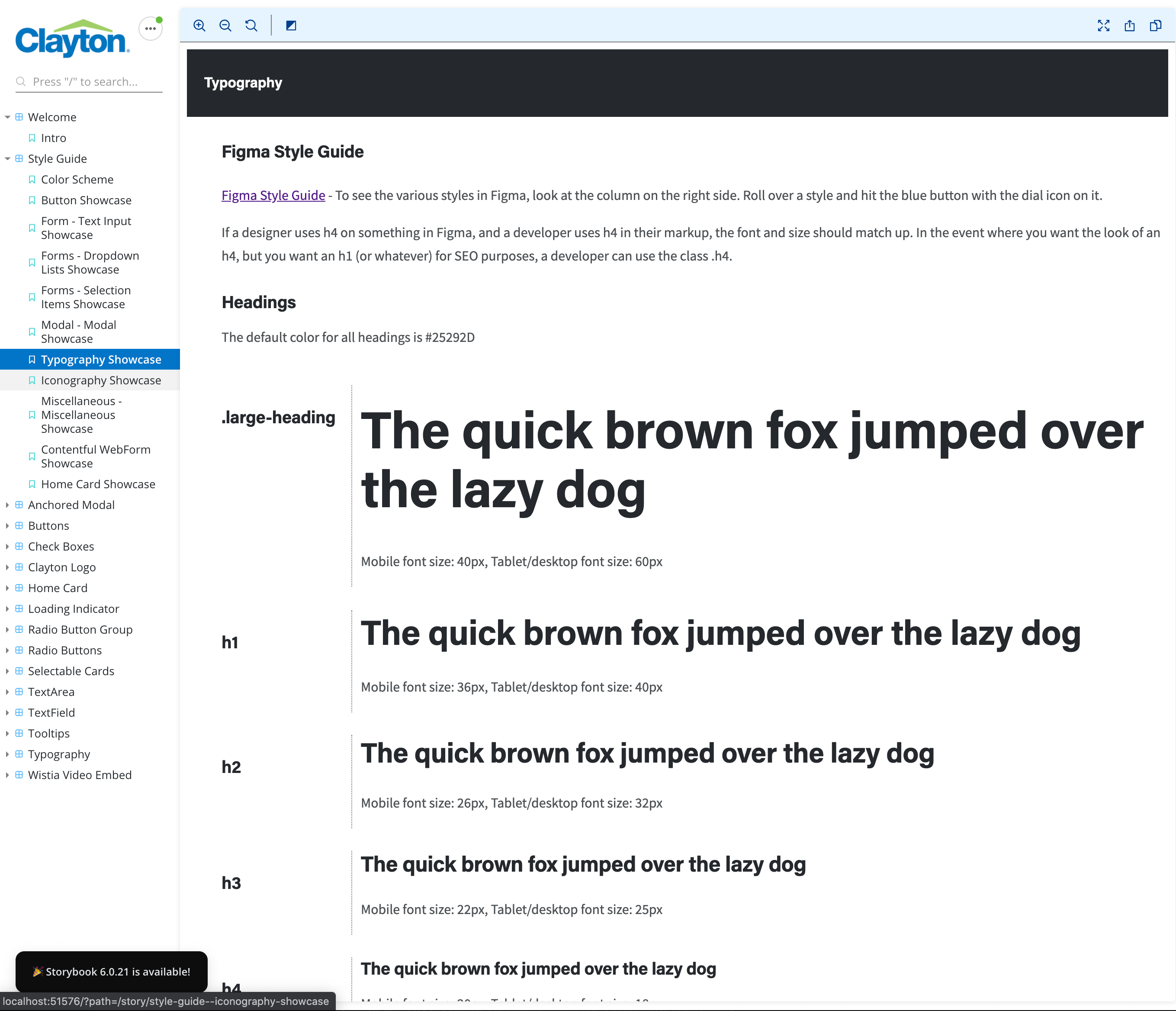
Component Library Typography
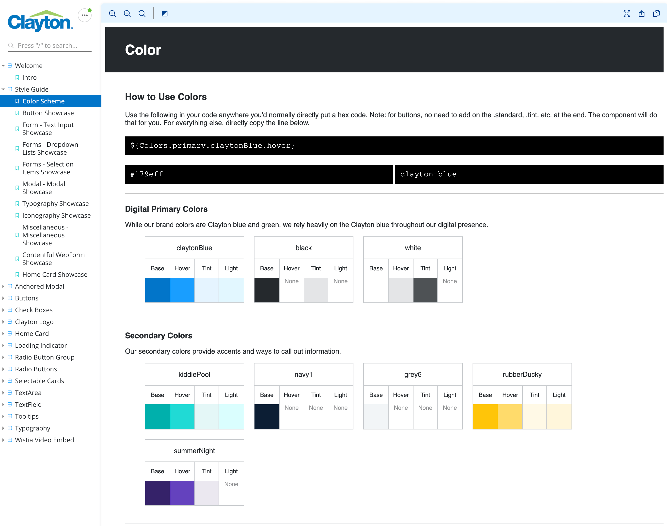
Component Library Colors
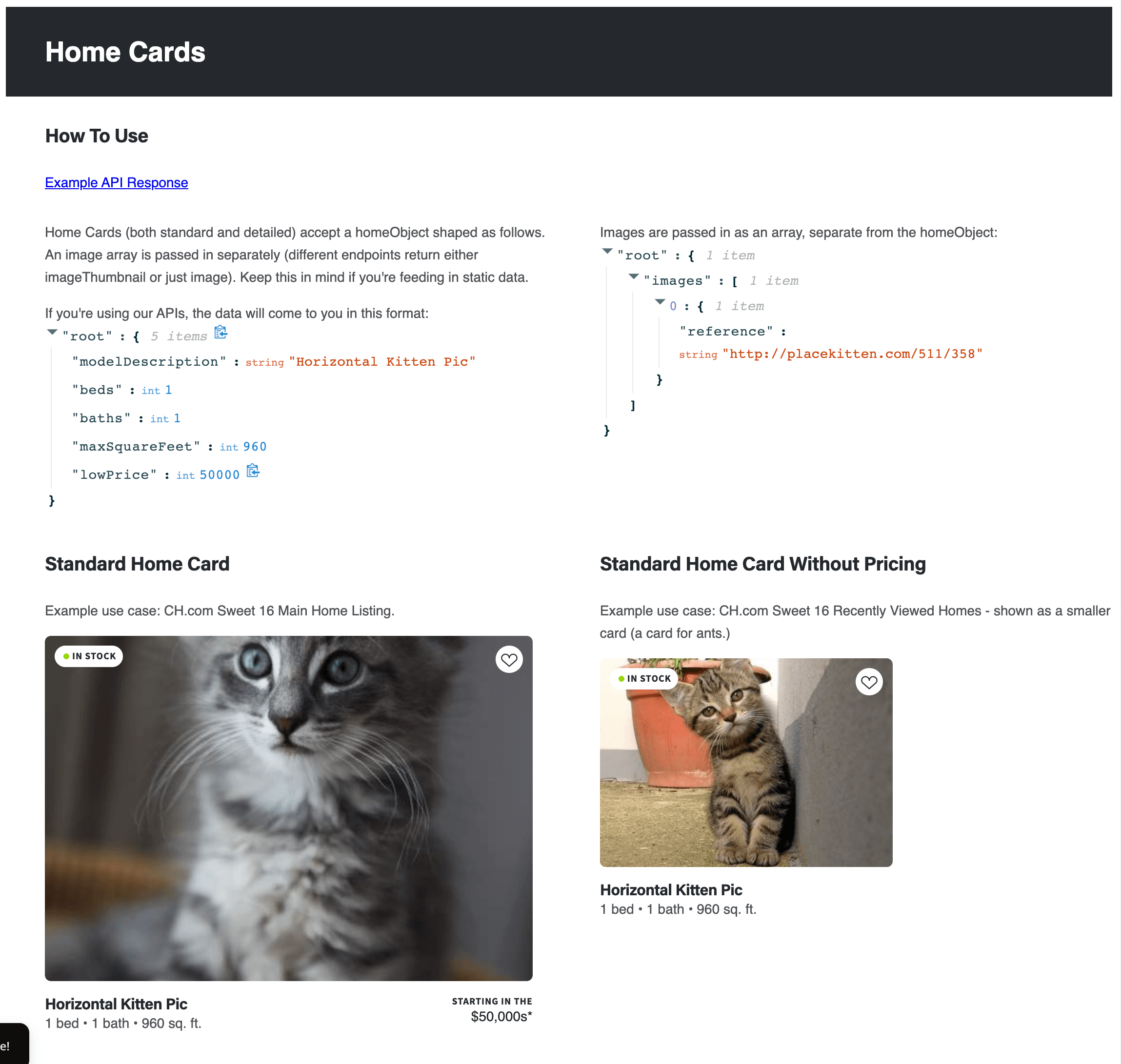
Component Library Home Cards (and accessibility knobs)
Component Library Buttons
